By Jayme Amos. Get free updates of posts here
The most important rule Dental Office Signs is #5. 
But make sure you see the examples at the bottom and the 6 things you need to include on your next sign.
The 5 Rules for Great Dental Office Signs
1. Go Outside
Look at your building and make sure traffic can see your sign clearly! I have seen so many practices that have good dental office signs that are positioned in a way that hurts more  than it helps.
A great idea I heard once was to get a cheap piece of plywood from Home Depot, Lowes, or your favorite home repair store and spray paint it with your name, position it (or ask a very good friend to hold it up) and drive past the building a few times.
This is a sign that will last you for many, many years. Just like a good try in for a crown, get a good try in on your dental office signs.
2. Free Advertising
Keep in mind that good dental office signs may prevent you from needing to place an ad. Yes, a sign can work that well. Some will even go so far as to make the signage their primary deciding factor on choosing one building over another. Certainly, it depends on your location but here is a true story: I work with a customer on a busy highway who has consistently gotten 35 new patients per month from her dental office sign alone! That keeps her from needing to place an ad.
Why?….because of the…
3. Phone Number.
 There are apparently more dental office signs out there without phone numbers than I think reasonable. In an era where people want instant gratification, how much better is it to help them with that? Help them call you on their drive by putting your phone number LARGE on your sign! Don’t assume they’ll go home, remember your clever name, write down the number, take it to work and then call you on their lunch break. Help people satisfy their desire to get things now and they’ll call. No phone number, no phone call.
4. Website.
Consider re-reading #3 and replace “phone number” with “website”. Now remember that 60% of phones are smart phones
5. Boring.
Yes, I’m suggesting you be boring with your dental office signs. Most marketing tries really hard. But so, so often marketing boasts the virtues of the business, not the benefit for the customer.
What did I say?
Don’t let your sign say much. For example, if your sign has the 4 types of dentistry on it that you want to be known for, your phone number, your slogan, your website, your logo,  your name, your special color scheme and your practice name, you better have a billboard, not a sign.
So by boring, what I mean is that, while the virtues of your practice are important they really shouldn’t be on your sign. If you have enough space, here is what I have seen yield the highest new patient results– and the following order is specifically how I would prioritize the information on your sign:
a) The word “Dentist” or “Dental” as the first or second word of 3 maximum words on the first “line” of your sign.
b) A white background with dark colored letters – its been proven that its easier for the eye to read (think paper in a book) and since we’re hoping people can read your sign…you get the idea
c) Your name – required in most states
d) Phone number
e) Website
f) “Accepting new patients” as a possible flag or giant sticker of a bright color
g) Address, if required.
Dental office signs in PA, NJ and DE all have varying degrees of success but the elements needed for an effective sign are the same anywhere in the country. Let your sign speak the simplest of information to accomplish what you most want: awareness and new patients.
Here’s to you and new dental office signs!
By Jayme
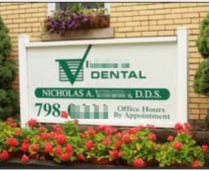
Good Examples|
Dare I call the good ones boring?
In a good way, I think I might!
(name, white background, phone)
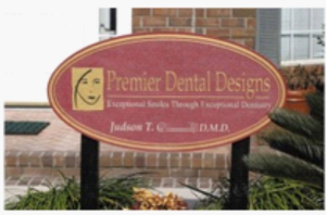
Not so much in love with these next examples.
Where is the phone, the web address and the white background?!


